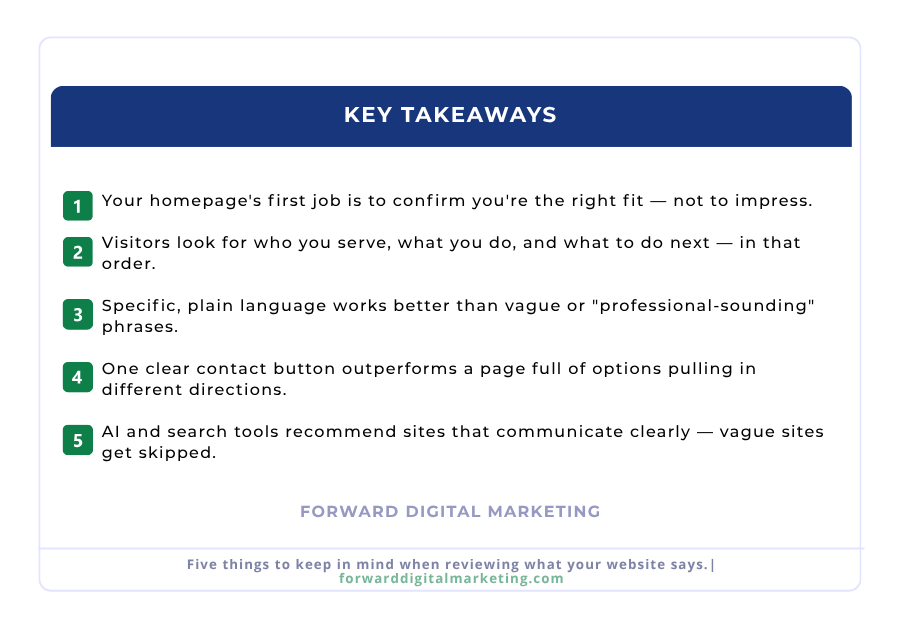
Every time someone searches for your service near them, a Google Ad decides who shows up first. It doesn’t have to be your competitor… but right now, it might be.
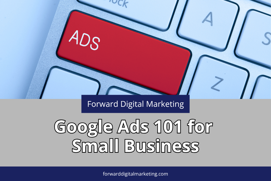
Google Ads in 2026 looks very different from even a year ago. The platform has been through significant changes — more AI, more automation, new requirements, and retiring features. For small business owners who’ve been curious but confused about paid search, this guide cuts through the noise and gives you the straight forward breakdown you actually need before spending a single dollar.
We’ll cover what Google Ads are, what’s changed in 2026, what they cost, and honestly… when they’re not the right move for your small business.
Quick Take
- Google Ads places your business at the top of search results when someone is actively looking for what you offer.
- You only pay when someone clicks — not just when someone sees your ad.
- The platform changed significantly in 2026 — AI now writes your ad copy, new campaign types are replacing old ones, and Google Business Profile verification is now required for Local Services Ads.
- A realistic starting budget for a local campaign is $300–$500 per month — but only if your website is ready to convert the traffic.
- Google Ads is not right for every business at every stage — and this guide tells you honestly when to wait.
At Forward Digital Marketing, we work with small businesses across Southeast Georgia and beyond who want their marketing dollars to do real work — not just create activity. Google Ads, when set up correctly, is one of the most targeted investments a local business can make. When it’s not set up correctly, it burns budget fast. We help our clients know the difference.
What Google Ads Actually Are — The Basics
When you search for something on Google, you’ll notice some results at the very top have a small “Sponsored” label. Those are Google Ads. Businesses pay to appear there when someone searches for specific keywords related to their products or services.
The key difference between paid results and organic results: organic rankings take months of SEO work to build. Google Ads can put you at the top of the page today. You pay when someone clicks — not just when someone sees your ad. You set a daily budget, you control who sees your ads, and you can pause or stop anytime.
For local service businesses in your small town — contractors, insurance agents, real estate professionals, restaurants, medical practices — this “pay per click” model means you’re spending money on people who are actively interested in what you offer, not just scrolling past.
What Changed in 2026… And Why It Matters for Small Businesses
This is the section most Google Ads guides skip. The platform looks very different in 2026 than it did even 18 months ago. Here’s what every small business owner running or considering ads needs to know right now.
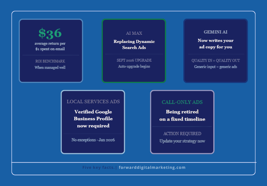
AI Max is replacing older campaign types. Starting in September 2026, legacy features like Dynamic Search Ads will automatically upgrade to AI Max — Google’s new AI-powered search feature that automatically matches your ads to relevant searches and customizes your ad copy in real time. For small advertisers with limited keyword lists, AI Max can expand reach significantly. But it requires proper setup and active oversight to work in your favor rather than against your budget.
Gemini AI now writes your ad copy. Google’s Gemini AI generates ad headlines and descriptions inside the Google Ads interface. The quality of what it produces depends entirely on the quality of what you put in. Generic business descriptions produce generic ads. Clear, specific descriptions of your services produce ads that actually convert. What you tell Google about your business directly affects the results.
Performance Max is Google’s default recommendation. Performance Max is a single campaign type that spans Search, Display, YouTube, Gmail, and more. When set up correctly with strong assets and meaningful conversion data, it can be powerful. When it’s not set up correctly, it distributes budget across channels you’d never consciously choose with very little visibility into where the money went. For most small businesses just starting out, a standard Search campaign is a safer, more controllable starting point.
Call-only ads are being retired. If your strategy relied on phone-call-focused ads, this is your signal to update your approach now rather than scramble later when the retirement is complete.
Google Business Profile verification is now required for Local Services Ads. As of 2026, only businesses with a verified Google Business Profile can run Local Services Ads. If yours isn’t verified and complete, that needs to be fixed first… no exceptions.
What Does It Actually Cost?
This is where most small business owners either overestimate or underestimate — and both mistakes are costly.
In 2026, Google Ads rewards businesses that focus on buying intent instead of vanity traffic. High-intent keywords — specific searches from people ready to act — bring better leads, stronger conversion rates, and lower wasted spend than broad, generic keywords targeting large audiences.
For local service businesses in a smaller market like Southeast Georgia, cost-per-click for specific local keywords is typically lower than in major metros. A realistic starting budget for a local campaign is $300–$500 per month — enough to gather meaningful data and see real results if the campaign is properly structured.
What that budget cannot do: broad, unfocused campaigns targeting vague keywords across a large geographic area. The honest math: a $400/month Google Ads budget for a local plumber or insurance agent that generates two or three qualified leads per week is an exceptional return. The same budget spent on broad keywords with no strategy is money gone with nothing to show for it.
Is Google Ads Right for YOUR Small Business Right Now?
Here’s the checklist we use with every client before recommending paid search. Be honest with yourself as you go through it.
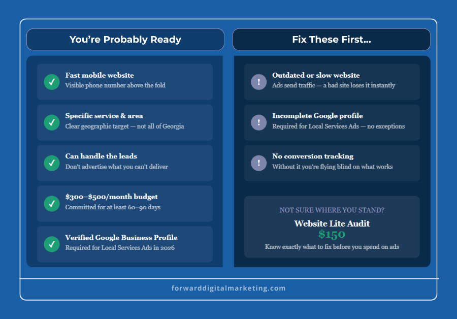
You’re probably ready if:
- Your website loads fast on mobile and has a clear phone number visible immediately
- You have a specific service with a specific geographic area you want to target
- You can handle the leads — don’t advertise what you can’t deliver
- You have a realistic budget of at least $300/month to commit for 60–90 days
- Your Google Business Profile is verified and complete
Fix these first if:
- Your website is outdated, slow, or hard to use on a phone — paid traffic sent to a weak site is wasted money every time
- Your Google Business Profile is incomplete or unverified — this is now a hard requirement for Local Services Ads
- You don’t have conversion tracking set up — without it, you have no visibility into what’s actually working
The Most Common Google Ads Mistakes Small Businesses Make
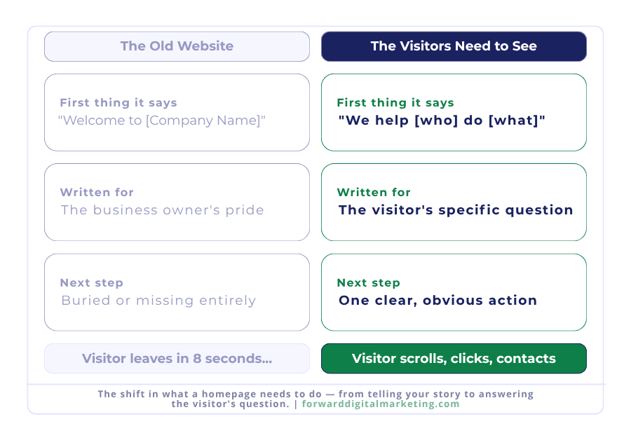
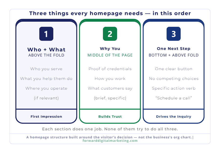
Sending paid traffic to your homepage. Your homepage is for everyone. Your ad landing page should speak directly to the person who clicked your specific ad. A mismatch between what the ad promised and what the page delivers kills conversions and raises your costs.
Setting it and forgetting it. Google Ads works when it’s managed with intention. It doesn’t work when it runs on autopilot with Google’s AI making all the decisions unchecked. Review your campaigns weekly at minimum — especially in the first 90 days.
Targeting too broadly. “Plumber Georgia” is a waste of budget for a Jesup plumber. “Emergency plumber Jesup GA” is a customer ready to call. Specific beats broad every time in local paid search.
Ignoring negative keywords. These are the search terms you tell Google to never show your ad for. Without a negative keyword list, you can end up paying for clicks from people searching for things completely unrelated to your business.
Trusting all of Google’s default settings. Many of Google’s defaults are designed to maximize spend, not maximize your return. Know what you’re turning on — especially with AI Max and Performance Max — before you flip that switch.
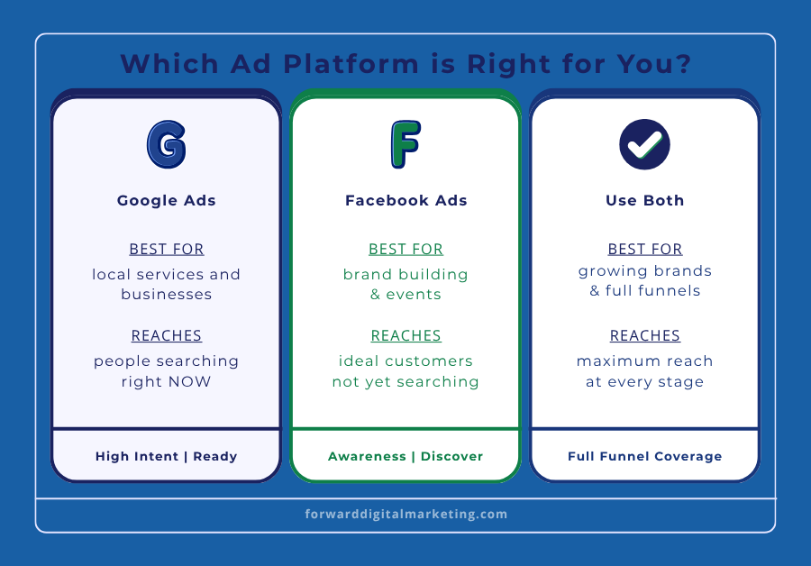
Google Ads vs. Facebook Ads — What’s the Difference?
A question we get often from local business owners: should I run Google Ads or Facebook Ads?
The honest answer depends on your goal. Google Ads reaches people actively searching for what you offer right now — high intent, ready to act. Facebook Ads reaches people who match your ideal customer profile but aren’t searching yet — good for awareness and brand building.
Both work. Neither is wrong. The right one depends on where your business is right now and what you’re trying to accomplish. Most established businesses eventually use both — search ads to capture demand, social ads to build it.
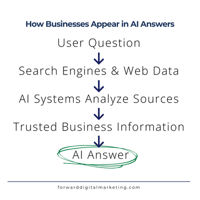
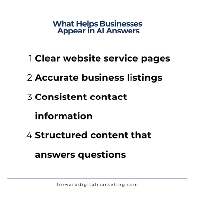
One more thing worth knowing: as of early 2026, OpenAI confirmed it is testing ads within ChatGPT for US users. Small businesses cannot directly purchase ChatGPT ads yet, but the paid advertising landscape is expanding beyond Google. Another reason why your website foundation and online presence matter more than ever — AI tools draw on publicly available web data when answering questions about local businesses and services.
Frequently Asked Questions
How long before I see results from Google Ads?
Most campaigns need 2–4 weeks of data before Google’s algorithm fully optimizes delivery. You may see clicks and leads in the first week, but meaningful performance data takes at least a month. Campaigns that are paused too early — before enough data is collected — never reach their potential. Commit to at least 60–90 days before evaluating results.
Do I need a big budget to get started?
Not necessarily — but you do need a realistic one. For local service businesses in Southeast Georgia, $300–$500 per month is a workable starting point for a tightly targeted campaign. Less than that and you won’t collect enough data to optimize effectively. The budget isn’t the only factor — a well-structured $300/month campaign will outperform a poorly structured $1,000/month campaign every time.
What’s the difference between Google Ads and Google’s Local Services Ads?
Standard Google Ads are pay-per-click and appear at the top of search results. Local Services Ads appear above standard ads, show your business name, rating, and a “Google Guaranteed” badge, and you pay per lead rather than per click. Local Services Ads require verification through Google — including a Google Business Profile — and are currently available for specific service categories. For qualifying businesses, they can deliver very high-quality leads at a lower cost per acquisition than standard search ads.
Can I manage Google Ads myself or do I need an agency?
You can manage Google Ads yourself, and Google makes it easy to get started. The challenge is that easy to start doesn’t mean easy to optimize. The platform’s defaults favor Google’s revenue, not your return. Many businesses spend months on self-managed campaigns that are technically running but not performing — and they don’t know why. Working with someone who manages campaigns regularly means you’re not paying for the learning curve out of your marketing budget.
What happens if I pause or stop my campaign?
Your ads stop showing immediately and you stop being charged. Any data collected stays in your account. If you restart, campaigns typically need a short re-optimization period — especially AI-managed campaigns that rely on historical data. Pausing for a short period is fine. Stopping and restarting repeatedly disrupts the algorithm’s learning and reduces performance.
Should I fix my website before running Google Ads?
Yes — without exception. Google Ads drive traffic. Your website converts that traffic into calls, inquiries, and customers. If your homepage doesn’t clearly communicate what you do, load quickly on mobile, or make it easy to contact you, every dollar you spend on ads is partially wasted. Fix the foundation first, then invest in driving traffic to it.
What to Do Next
Google Ads works for small businesses in 2026 — but it works when it’s intentional, properly structured, and actively managed. Here are three places to start depending on where you are right now.
Check your foundation
Before running any ads, make sure your website is ready to convert the traffic you’ll be paying for. Check mobile speed, verify your Google Business Profile, and confirm your phone number is visible above the fold.
Get a website audit first
Our Website Lite Audit ($150) reviews your site page by page and gives you a prioritized action list — so you know exactly what to fix before spending money on ads. It’s the most practical first step for businesses considering paid search.
Talk to us — free
Not sure if Google Ads is right for your business right now? We’ll tell you honestly — and if the answer is not yet, we’ll tell you what to do first. Free 15-minute consult, no pressure.